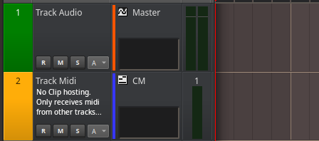
I think there is a simpler solution.
I appreciate the effort anyway.
---OPTION 1---
The simplest solution:
If we create a "comments" property on tracks the need to have to put long names disappears.
I think implementing a new property on tracks is less effort than what you have had to do.
You wouldn't have to touch anything in the interface (if that's what you're worried about).
Qt is capable of representing html formatting.
We would insert a line break and the smaller font size with html.
The information to be represented in the track name would be:
"$Track_name"+"<br><font size=8>$Comment</font>"
This doesn't invalidate what you've done, which can still be useful if you use "enter" because what you want is to split a long name but not create comments.
---OPTION 2---
It's a mix of the two solutions:
Leave it as it is.
Create an array with the name:
$Name_to_represent[0]= Text before the line break
$Name_to_represent[1]= Text after the line break
The information to be represented in the track name would be:
"$Name_to_represent[0]"+"<br><font size=8>$Name_to_represent[1]</font>"
---OPTION 3---
Leaving it as is and allowing the user to enter the html tags... would be like a hidden trick.
I've done a test and although it doesn't have an effect on the track, it does on the information bar. :0
Interestingly, it fulfills the function of leaving notices and drawing attention.
XD XD XD
https://www.rncbc.org/drupal/files/attention.gif
CONCLUSION:
I think option 1 is the most usable.
It makes it clear where to perform a specific task, comment on tracks.

Ops!
Regarding the gif and the Suggested Options.
I just found out that html is not being rendered in track names.
When I tested it I thought it was because Qt sanitized the text with html entities if it came from a form.
But that's not the case. Track titles don't support html format, I tested it from the code.
The fact that the statusbar did support it should have made me suspicious.
But I thought that this type of element was not carried out the sanitized one.
Anyway, the options I propose are useless :).
If you think Option 1 really brings something worthwhile, and you see a simple way to implement it, that would be helpful.

(You probably don't consider this an improvement, and I respect that.)
"Comments" property on tracks. Rendering below the name in a smaller size to fit more text and make it more aesthetically pleasing and legible.
If not, shortening the names seems to work and eliminates the annoyance of "biblical names".
It allows commenting, with limitations, but it does.
You can delete this thread
Forget everything I said.
It works perfectly like this. You just have to expand the margins and any comment, no matter how big, is readable and aesthetic.
I've gotten used to having everything so in its place that I forgot that we can expand and reduce the width (and height of course) at will.
Thank you very much
VTQS will have an update
/* // qtractorTrackForm // */ qtractorTrackForm QTextEdit#TrackNameTextEdit { max-height:2000; }Anyway I think this behavior
Anyway I think this behavior would be desirable natively by default
Thanks Rui
I just checked that you already took this into account.
Thanks
Can I take this opportunity
Can I take this opportunity to ask for a feature request that came up along the way? I'd like to see the
Nrcolumn include a new icon (arrow perhaps) to toggle a "fold" of the track height. The fold would toggle between a track's minimum and last height (or maybe just call theReset) if that's smarter. This would be useful in order to bypass the 5 trips currently needed to the "right click > height > decrease" operation (or 5 keybinds if mapped) needed to minimize completely. The icon I'm proposing would need to take priority over any instrument icon since a track fully minimized could only really show a single icon. Aside from the savings (of steps) already mentioned, I think users would find the feature intuitive since it essentially mocks what is typically found in most editors and those working with dozens or more tracks (orchestra) would have a speedy method to reclaim real estate.I've been missing that for
I've been missing that for years too.
Ctrr+Shift+0
Maybe if implementing the arrow is too complex, have Ctrr+Shift+0 toggle between collapse and pre-collapse height.
Titles support Emoji... Good news
This is very powerful for documenting and create pre-configured, ready-to-share session templates.
And even better, the information is displayed in the status bar.

The MidiController template is becoming more and more colorful.
It looks like a native functionality that describes itself.
The user just has to use it without worrying about how it does things, or what plugins are actually operating.
Everything is out of the box ready to use.
Add new comment