You are here
Add new comment
So I just changed over to
So I just changed over to your icon set simply to revisit my assertions and allow myself a chance at being pleasantly surprised. That said, I am completely reminded as to why I'm still using transparent images to "fake" things in order to clean up the UI. Most of these things have been discussed in the forum at various times but I'm just going to make a few points after seeing some of these things now (which I haven't seen in some time).

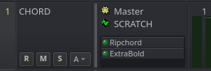
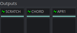
The Bus Type icons offer absolutely no value whatsoever. Sure, they did... once upon a time. Now that the colored vertical bar (shown gray here but that's just my preference on the color used to specify MIDI) has been provided, we always know at a high level, if a given track is MIDI or Audio. Therefore, these 2 icons are just redundant and needlessly consuming valuable screen real-estate while also resulting in a more "cluttered" look.

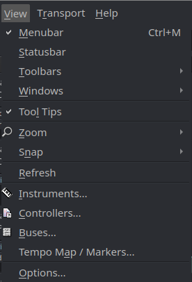
Only the checkmarks are providing any functional value as they indicate the state of a given thing (on/off). The other icons are providing no additional value. Let's be honest, it's just "eye-candy". No single person on the planet clicks on a pull-down menu in order to reach for some functionality and then "looks" for a feature-associated icon :D What we do is, we pull down the appropriate menu and read the words describing the options until we find what we're looking for. In fact, I'd argue we remember those options by name (and document them as such as well). The icons are just "feel good" things we're emotionally afraid to leave behind.

Again, due to the information provided by the new horizontal bars, the icon is just bloating things up while consuming valuable real-estate which would be better used for the text label itself. There is absolutely no functional value provided by these icons here.
All said, I totally appreciate what you've provided G3N-es but wanted to make these points while they were in my head after taking a fresh look.
Carry on...

Recent comments
12 hours 15 min ago
12 hours 59 min ago
13 hours 27 min ago
12 hours 8 min ago
15 hours 1 min ago
15 hours 50 min ago
1 day 11 hours ago
1 day 12 hours ago
1 day 13 hours ago
1 day 13 hours ago